Hello and welcome! I’m so glad you’re here. Feel free to explore some of my latest work!
For nearly two decades, I’ve had the privilege of leading creative teams and shaping brands that leave a lasting impact. My journey has taken me through a variety of roles where I’ve overseen everything from major conferences to large-scale creative projects across multiple continents. Along the way, I’ve mentored designers, writers, developers, and video editors—helping them grow into collaborative professionals (and making sure we had fun too).
I’m passionate about building brands, crafting meaningful stories, and aligning creative efforts with business goals to drive results. Whether it’s developing strategy or fine-tuning the details, I love fostering creativity and creating environments where people and ideas can thrive.
ACG + PS
Merging two tech education brands into one. Director of Brand Strategy and UX, 2021 to 2023.
Pluralsight acquired A Cloud Guru in 2021, which left us with two brands that people genuinely liked and no good reason to keep both. A Cloud Guru had personality and a loyal following. Pluralsight had scale and enterprise trust. The job was to end up with one brand that kept what mattered from each.
I led the integration from strategy through identity and rollout. That meant deciding what the combined brand actually stood for before anyone touched a logo, then building the system that would carry it: identity, voice, guidelines, and the merger of both companies' websites.
We shipped the unified identity in 12 months, published the brand guidelines that the whole company still works from, and brought two separate web presences together into one.
Project Timeline
Oct 2022 – July 2023
Brand Guidelines
Team Members
Matt Kohn
Creative Direction, Art Direction, Planning
Matt Kohn, Adam Gunn, Jen Slaski
Brand Strategy
Matt Kohn, Ryan Lewis, Shannon Parrish, Emily Roeder, Luke Etheridge
Design and Illustration
Michael Walton, Emily Hill
Copywriting
Tags
Brand Strategy, Creative Direction, Illustration, Branding, Design
AWS re:Invent
The Challenge:
AWS re:Inventis the largest cloud conference of the year. With Pluralsight’s acquisition of A Cloud Guru in 2022, our goal for 2023 was to build on ACG’s strong brand equity while positioning Pluralsight as the new leader in cloud learning and raising awareness of our expanded offerings.
The Solution:
We anchored our campaign around the familiar phrase “Hello Cloud Gurus,” leveraging ACG’s brand recognition to attract attendees. This tagline not only welcomed existing fans but also created a perfect opportunity to introduce Pluralsight’s broader learning solutions, seamlessly merging the strengths of both brands.
Matt Kohn
Creative Direction, Design
Adam Gunn, Luke Etheridge, Ryan Lewis
Design and illustration
Matt Kohn, David Neil
Game Development
SPICEWORLD - The IT Conference
Team Members
Matt Kohn
Creative Direction, Art Direction, Planning, Lead Design
Sarah Pedregon
Hub Planning and Hub Art Direction
Sarah Pedregon, Ryan Lewis, Ryan Vatzlavick, Matt Kohn, Luke Etheridge
Design, Illustration
Andrew Baron, Dana Moberly, Elisa Gladu, Todd Darroca
Copywriting
Roy Pena, Malcolm Hardiman
Video Editing
Dana Moberly, Elisa Gladu, Todd Darroca
Project Owners and Event Planners
Tags
Creative Direction, Event Design, Illustration, Signage, Production Planning, Presentation Design, Project Management
The Challenge
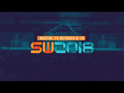
SpiceWorld: Every year since 2008, Spiceworks has hosted an annual user conference. It has grown in attendance year over year, and demands a fresh look and feel with each event (while remaining on budget). In 2017, the conference moved to a new section of the Austin Convention Center. In 2018 we needed to come up with new activations to fill spots in places that we felt needed more activity and life. We were also given full control of the Hub merch store and brought forth a side of creating unique cool IT related merchandise to continue to grow and bond the community.
The Solution
We launched a signage plan by walking through the space and planning the new user experiences, adding additional pieces based on ideas we saw throughout the year. We also planned early for the merchandise we wanted to fill our hub. We knew t shirts went over really well with our users selling out the 2 designs we made the year before.
I used the guidelines to oversee a team hard at work on design and production. It was all with the aim to ensure we got over 430 deliverables delivered on time and with a consistent look and feel.
We grew the event to 1650+ registrants, many of whom journeyed from outside the country to experience powering IT together.
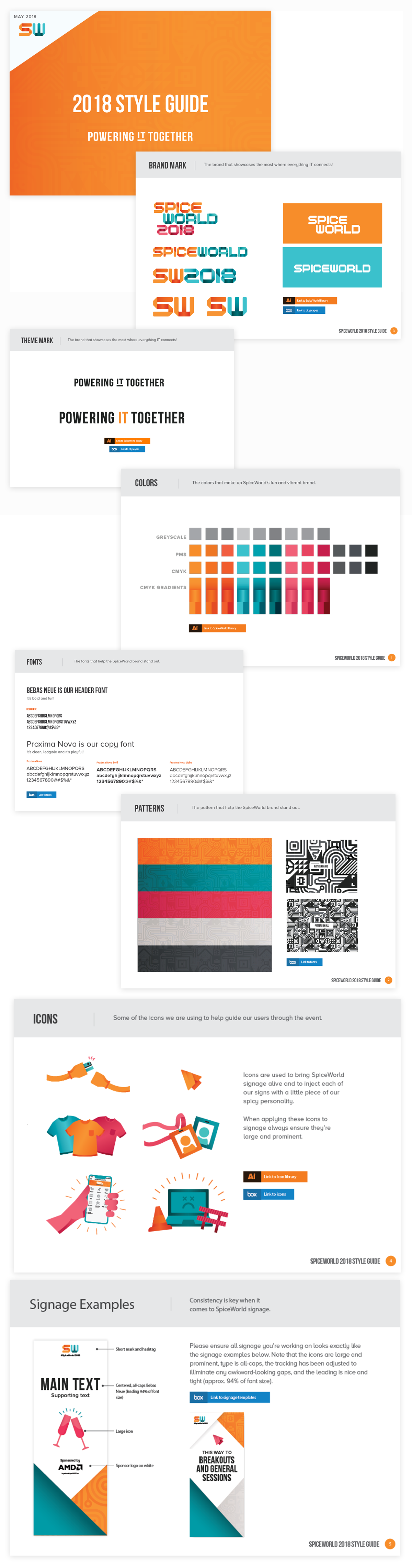
We started with a basic set of brand guidelines to help consistency across the project and event. This helped designers have a starting place on all projects and gave the production designers the ability to move at a fast pace.
Our annual promotional video taking on the brand.
The brand then moved into our first produced deliverable for the event in the website. The website is meant to get IT pros and Tech marketers the info they need to attend the event.
We kept the theme going throughout every touch point of the event bringing the look and feel to life. We also included our theme mark to re-emphasize and drill in our theme of powering IT together.
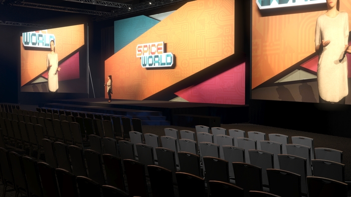
Updating the look and the feel while remaining on budget for the general session room had proven to be a challenge every year. This year we decided to do some video mapping to make the costs a bit more reasonable.
We also get to design the entire exhibit hall and Spiceworks booth property. I provided creative direction working with lead designer Sarah Pedregon on this part of the project.
Rebuilding a ten year old beloved brand from the inside out. Creative Director, 2015 to 2018.
Team Members
Matt Kohn
Creative Direction, Art Direction, Planning, Design, Illustration
Diana Berno
Co-Art Direction, Lead Design
Clarice Bajkowski, Jenn Lindeman, Amanda Trudeau, Tim Bauer
Design
Andrew Baron
Copywriting
Chelsea Shaw
Development
Jen Slaski, Tim Weinheimer, Joe Stanfa
Consulting
Tags
Creative Direction, Branding, Illustration, Tools, Production Planning, Presentation Design, Project Management
The Challenge
How do you take a 10 year old beloved IT company and change the logo and all the assets associated? That is the question we sought after asking and answering over the course of 18 months.
There were definitely some technical issues with the old logo: having been designed in 2006, it wasn’t friendly to the modern digital space, it didn’t align to the pixel grid causing blurriness on retina displays, and it was stretched which made it difficult to fit into smaller spaces (mobile).
Our main concern was how disjointed and outdated the experience felt with our old logo and larger visual identity.
The Solution
We started with this project by defining our values, mission, vision, and purpose. Once we had those dialed in we looked at how we could bring the Spiceworks visual experience to life in ways that align with who we are as a company today. After months and months we culled all designs down to 4 finalists, which we then presented to our executive staff. After including feedback and research across the company and across our user base we were able to then land on a finalist. The new mark represents the overlapping pieces of the IT industry and how Spiceworks is at the center of it all. The hidden S in the flames is a nod to this.
I then coordinated updates to web properties, building signage, presentations, email signatures, business cards, stationary, swag, and building decor across our US office and our London offices. We also built an online style guide to ensure consistency across multiple teams.
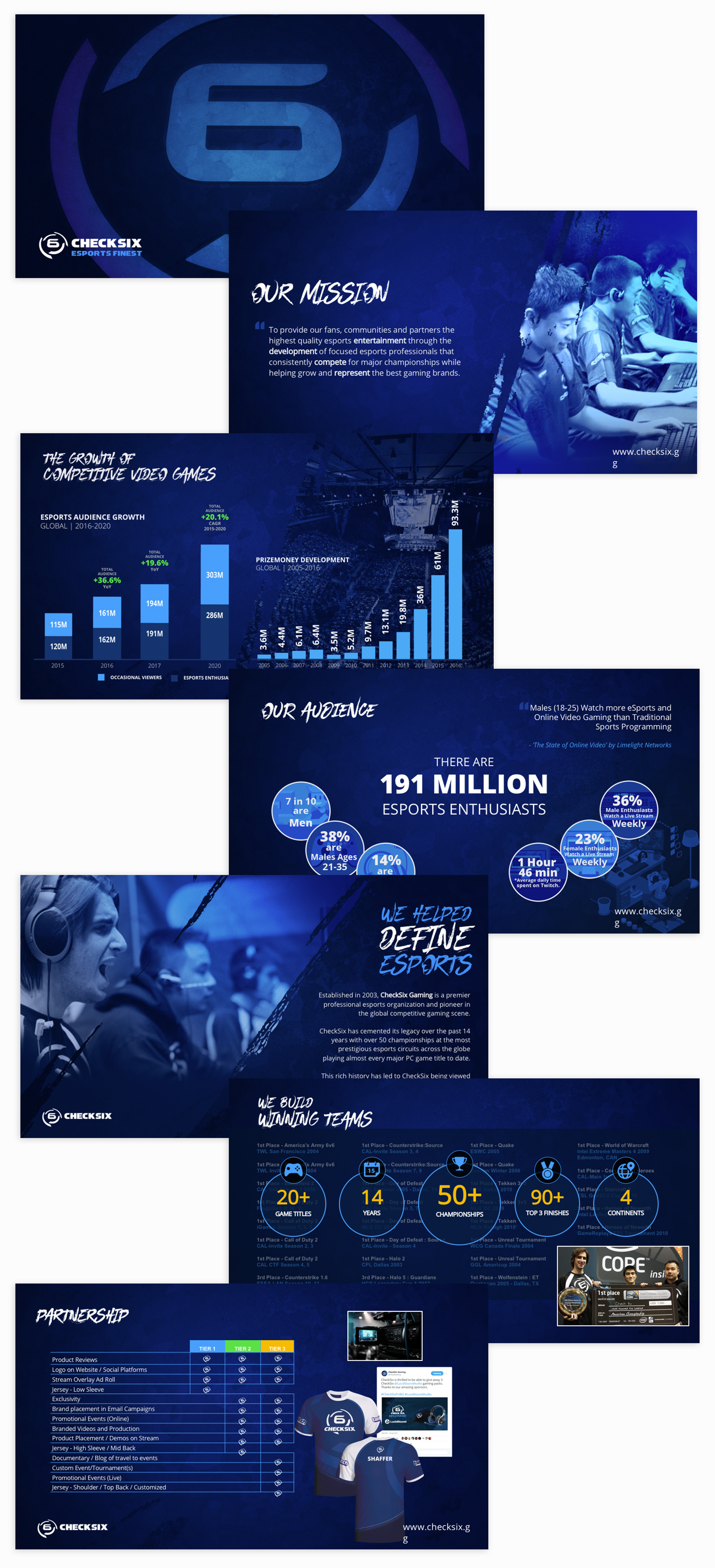
Established in 2003, CheckSix Gaming is a premier professional esports organization and pioneer in the global competitive gaming scene.
CheckSix has cemented its legacy over the past 14 years with over 50 championships at the most prestigious esports circuits across the globe playing almost every major PC game title to date.
This rich history has led to CheckSix being viewed as a passionate trusted brand and partner within the esports industry. I am a current owner of the organization and have been on board since 2006.
The Challenge:
CheckSix had taken a bit of a hiatus while planning the next phase of where the organization wanted to concentrate its efforts. With the lapse in time we felt it would be good to re launch with an updated brand and something that would help us stand apart in the esports industry. I needed to set up a series of guidelines and standards that we could then use to create content and other brand facing communication.
The Solution:
I stuck with the roots and previous brand mark. It had gained a size-able following at the height of our operations and I did not want to lose any recognition from this. We updated the mark to be a more clean geometrically accurate version of the previous mark. We also update the word mark to have a more collegiate or sports feel.
Matt Kohn
Designer, Motion Designer, Branding, Creative Direction
The brand then needed a home base so I custom built a quick and easy Wordpress theme to help us with communication.
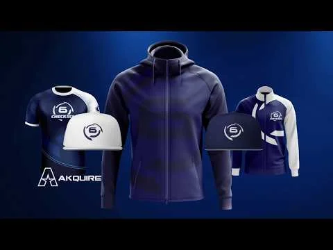
I worked with our clothing partner Akquire to create designs that set us apart from the competition while remaining true to the brand.
The brand was most put to use in our social communications. Communicating different events, matchups, giveaways and stream notifications.
I storyboarded out exactly what I was thinking for each sponsor representation then design and animated this partner announcement.
I wrote and produced all content and design for our pitch decks. We use these to have conversations with major brands about investments and partnerships.